I have previously written about accessibility in video captions, presentation slides, and disabilities, and I thought I should expand on the latter topic as it relates to typefaces, or what we call “fonts.”
To be precise, a typeface is a type design, and a font is a subset of a typeface. Unless you work in journalism or are a type nerd, it doesn’t matter, and you can use the terms interchangeably without much confusion. When people say “font,” they mean “what the text on the screen or page looks like,” and if I say “Times New Roman,” you think of what Microsoft Word and WordPerfect used to look like.
Two of the most common typefaces are Times New Roman (a serif typeface) and Helvetica (a sans-serif typeface), and you can find many fonts which exist as subsets within each family.
Serif and sans-serif?
The biggest difference between typefaces is whether the characters have a little extra flair on the end of an upstroke or downstroke. This flair is called a “serif,” and it is what makes some typefaces look old-fashioned. Consider a modern example of a brand that freshens up or simplifies its look by getting rid of the flair. The simpler typeface (without the flair) is known as “sans-serif” (“sans” is a French word which means “without”).
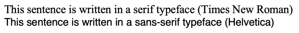
In the above image, you can see classic Times New Roman, very popular in newsprint and the original World Wide Web. Below it is a sample in Helvetica, which was developed in the 1950s and was very popular in the latter half of the 20th century owing to its modern look and feel. Many newer typefaces are influenced by Helvetica, including the Monotype font Arial, and Microsoft’s Calibri, Verdana, and Tahoma.
How does this relate to accessibility?
In this section I refer to fonts as opposed to typefaces, because we’re drilling down into their specific properties.
A number of factors can influence a font’s readability, and thus its accessibility. This ranges from the size of the font, line height (or distance between lines and paragraphs), justification (whether the lines of a page are of perfectly equal length or have a jagged edge), the kerning (or distance between individual characters), case (i.e., upper and lower-case), and so on. Even more important is a font’s ability to distinguish between characters that look similar. For example, can you tell the difference between a lower-case L, the number 1, and an upper-case I in many sans-serif fonts? Or how about the digit 0 and an upper-case O? In this paragraph I’ve highlighted them with the <code> tag under the covers to make them easier to read, but it’s a common issue for many fonts to make these indistinguishable to most people.1Aside from an accessibility issue, this is a reason why malware infections are made easier, where a particular character in a URL is substituted for a lookalike, which you may miss when clicking a link.
As I mentioned in the previous post about hidden disabilities, being able to read text is an accessibility issue even if you don’t consider yourself disabled. A difficult-to-read font will affect your ability to process information, and you might find yourself re-reading the same paragraph over and over because — well — it’s just not sinking in.
What font should I use?
I like sans-serif fonts because they’re modern, but I have no issue with writing technical documentation in Times New Roman, for example. There have been several studies over the years to see whether it’s easier to understand text that has been styled serif as opposed to sans-serif, but as I understand it, the serif matters less than how you use it. If you need to share deep technical information, make sure you write clearly, pick a reasonable font size, and where possible give the reader the ability to change the font. One of the greatest inventions for my money is the electronic book reader (the Amazon Kindle, or Apple iPad, for example). They allow you to set the font style, text size, line spacing, justification, and various other attributes, which makes it easier to consume electronic text.
When it comes to presentation slides, you can always read my previous blog post, but in summary you should try to reduce the number of words on a slide and have the focus on you as the presenter. In virtual meetings this becomes trickier, which is why I recommend experimenting with streaming technology where you can choose when your audience is looking at you, and when they need to look at the slides.
Some people suggest not having more than a certain number of font styles on a page (or slide), and while I agree that too many is too many, there’s no perfect answer as it depends on what you’re presenting. I generally stick with between one and two styles, but that’s not a hard and fast rule. Clarity and legibility, above all.
Share your font thoughts in the comments below.
One point that I have come to notice these last few years is that your eyesight at 50 is really not as sharp as it was when you were 25. And a lot of people who work with type for publishing are young and have good eyes. That being said, pixel-sizes on monitors are getting smaller as time goes by and this really doesn’t help. Smaller type-sizes are harder on older eyes.
I have had to start wearing glasses when I work on the computer and I have altered the default size & typeface in Firefox & SSMS to allow me to read text more easily and with less eye-strain.
There is an elephant in the room that I will not dare address here, partly because I am right and everyone else is wrong and partly because we should keep this thread civil.
To end, I am particularly partial to the typefaces designed by Hermann Zapf, in particular, Optima & Palatino. I find them very elegant and easy on the eye.
I’ll be writing a follow up post in a couple of weeks about preferred fonts and screen settings. One thing I’m happy to say out loud is that dark mode is difficult for me to read. I know I’m in a minority in this industry.
Comments are closed.